This featured set of booth display tips (Part 4 in a Series), we’re blurring the lines between practical and creative. Our practical tips is… well, obviously practical, but our creative tip is so super practical that it’s also creative…. And you can get as creative as you want with it!
Psst, if you haven’t read our other Flea Market Booth Display Tips, you’ve got to check these links out:
- Flea Market Booth Display Tips: Clearly Mark Prices & Evoke Nostalgic Feelings
- Flea Market Booth Display Tips: Easy Set-Up & Use of Space
- Flea Market Booth Display Tips: Labels & Eye-Catching Design
Practical Booth Display Tip #4: Maximize on Storage
This, this is why Tetris was so important growing up… because when you’re working in a 10 x 10 space, EVERY. SQUARE. INCH. MATTERS.
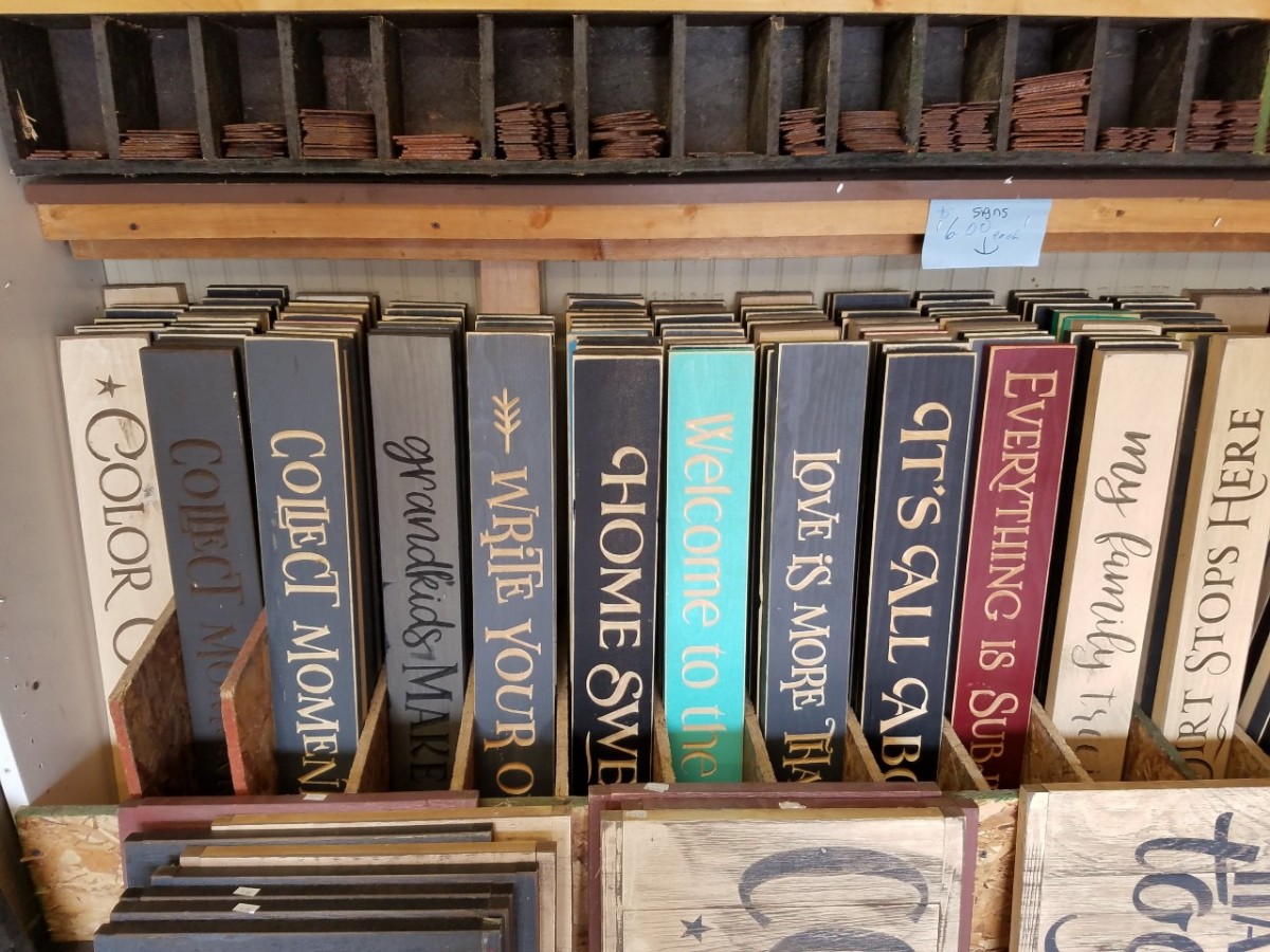
Or, if you’re like Oil of Gladness #619-620, you incorporate your storage right into your display.
I love how this booth vendor stores her signs.
It’s so practical and easy for customers to search through and find what they are looking for. You don’t have to go running in the back to see if you have a certain sign in blue… it’s all stacked right there for them!
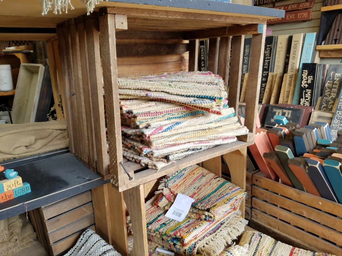
Here, she used dead air (you know, that spatial height that never gets used) to store her rugs.
Stack, Stack, Stack.
I’ve always been told, building up costs less than building out. Don’t rent two spaces if you can strategically sell and store your items using just one space by building up, and using spatial area that doesn’t normally get used.
Creative Booth Display Tip #4: Create Vignettes
So, here’s where our “it’s so practical, it’s creative” tip comes in…
Make the customers see YOUR piece in THEIR home.
The inspiration comes from Rick and Kathy Hundt, owners of Hundt No More #630 & #632. Rick and Kathy make and sell beautiful handmade furniture.
This table alone is gorgeous. AND look how beautifully accented it is. Now, imagine this table without the plates, bowls, silverware and centerpiece. With nothing on it, this table is still beautiful, but risks a greater chance of getting lost in the shuffle and overlooked. BUT when staged, it’s hard to overlook such a beautifully prepared setting… It’s a show-stopper.
From the sweet little deer to the corresponding wood pieces to the mismatched chairs and napkins, this vignette collectively screams “I’M BEAUTIFUL, TAKE ME HOME!” Using accents and home decor allows customers to SEE it… see how the piece is collectively complete and unified.
Do the work for your customers, instead of relying on them to imagine it in their home. MAKE them see it. SHOW them exactly how beautiful and amazing it would look in their home. Make it look so beautiful, they can’t say no.


