We’ve searched the Shipshewana Flea Market for some of the best booth displays that help bring customers in and keep customers there. Check out these vendor booth display tips (Part 1 in a Series) – all about labels and eye-catching designs!
Are you looking for some fresh new ideas to use at your next craft show or flea market event?
In this new series of blogs, we’re providing TWO amazing booth display tips – one practical tip and one creative tip. These were be inspired by real-life booths from right here at the Shipshewana Flea Market – the Midwest’s Largest Flea Market!
Practical Booth Display Tip #1: Use Labels
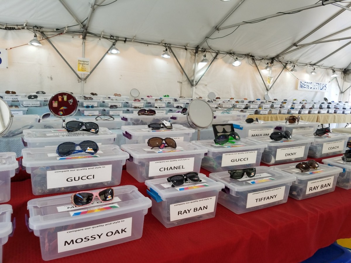
This practical booth display tip is to use labels! It is inspired by Steve and Kay Maycroft from Kay-See Marketing ( Booth #442-444). They sell all kinds of sunglasses and glasses including polarized, bifocals, fitovers, readers and children’s sunglasses.
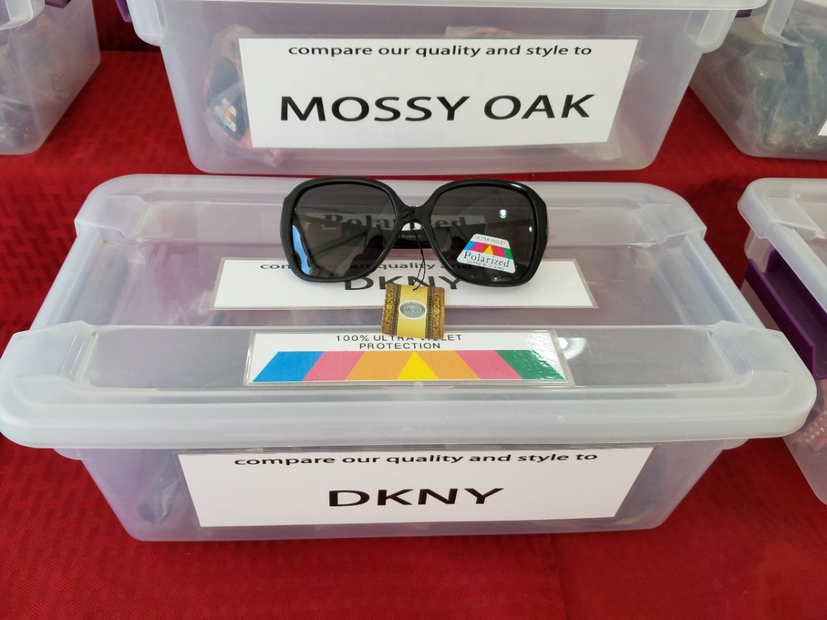
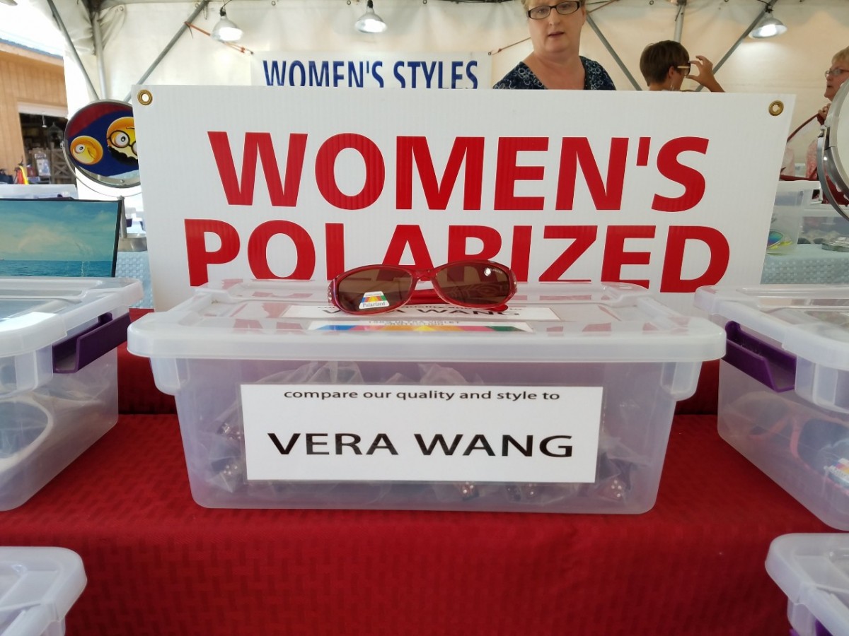
I love how everything is clearly marked and in its place. The labels are a nice large font and a script that’s easy to read!
You know exactly where to look and the type of product you are looking at. Who could ask for more?
Not only does this help customers clearly understand what they are looking at and buying, but it also allows for easy organizing for vendors.
If you find something out of place, you know exactly where to put it back! Anti-Clutter display options allow customers to clearly see what you offer and make decisions quickly.
Customers can spend less time attempting to sort and dig through items.
From my own shopping experience, I don’t necessarily want to dig around and waste a lot of time attempting to find something I might want. Instead, I would rather have things done for me! I want to see my options, not feel anxious about the clutter, then make my buying decision!
Creative Booth Display Tip #1: Be Bold & Eye-Catching
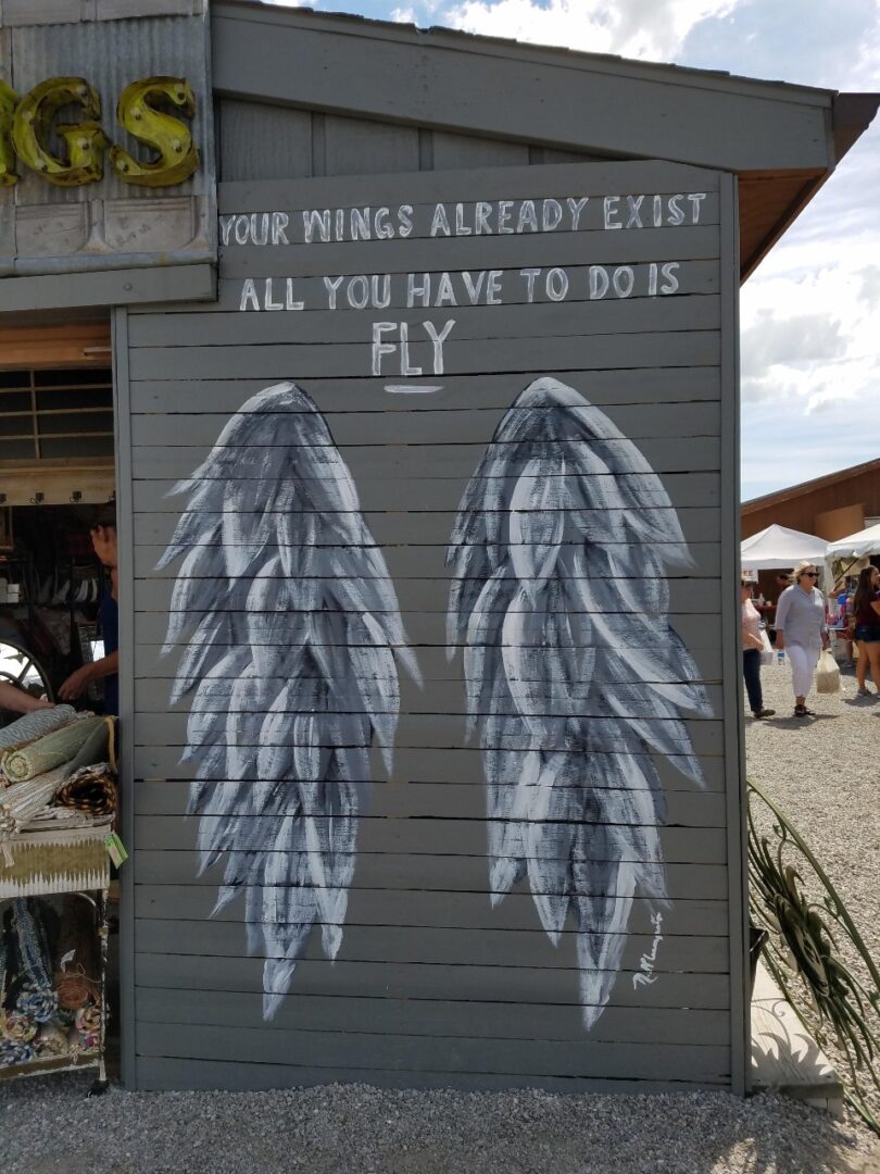
The creative booth display tip is to be bold and eye-catching! One great way to do so is to have a photo-taking station right at your booth, just like Bloom N Things (space #605) does here. The photo booth matches the vendor’s overall brand and target audience – they sell trendy home decor and farmhouse items.
For those right-sided thinkers, have fun with your creativity! These wings are the perfect eye-catching photo-op to pull customers to their booth. You can see them from a distance, and it encourages people to stop at the booth and have a little fun.
Plus, as a bonus, when people take a photo with them and post it on social media, you’ll get a ton of free exposure! It’s a win-win!
Now check out this display from the vendor called Specialty Tin Signs (Booth 700).
Nothing says “Stop at my booth” (literally) like a stop light. Know what else I love about this whole thing? That the green arrow is pointing to the entrance. Genius! And if anything, this eye-catcher is a great booth marker. It’s an “identifying” piece. If a customer can’t remember exactly where a booth is in the market, they can walk up to the office and ask, “Hey, where is that booth that has the big stop light out in front of it?” and more than likely they will be able to identify the vendor and booth number!
Take some time to think about these two tips, how can you be a little more organized when selling at flea markets? How can you make a bold statement or catch the eye of customers?
Whether you’re creative or a little more logic oriented, think about the display of your own booth and how you can continue to improve on your business.

